Color grading takes forever. And your probably guilty (because I’ve done it) – of throwing a LUT on your footage and clicking the export button. The footage always ends up looking ‘bleh’ though. I would start to watch tutorials on how to color grade and people started talking about curves. So I gave it a shot. And dang… the footage looked even worse.
When I applied the curves effect to my footage I had no idea what I was doing. I didn’t know what I was looking at – and the more time I spent adjusting this little line, the weirder my footage started to look. It thought only professionals could use curves. And I apparently wasn’t a professional.
Imagine being able to apply curves to any sort of footage and be in full control of the outcome. Being able to add in subtle contrast, and craft a custom cinematic look for each film you put out.
Maybe you’ve been in a spot like me where curves seem insanely confusing. Today I’m going to break down exactly how to color grade using curves and why it’s an essential tool for you.
How to color grade using the curves tool
Curves give you the most bang for your buck in how to color grade. If you learn how to use curves, you’ll be the most powerful filmmaker around. You’ll be able to correct and style your footage to look cinematic and gorgeous.
“But Chris, I’ve tried curves and it doesn’t seem that cool. How do I use them?”
Curves control almost every aspect of color and exposure in your film.
On curves in Premiere there are 4 lines (a white, red, blue, and green).
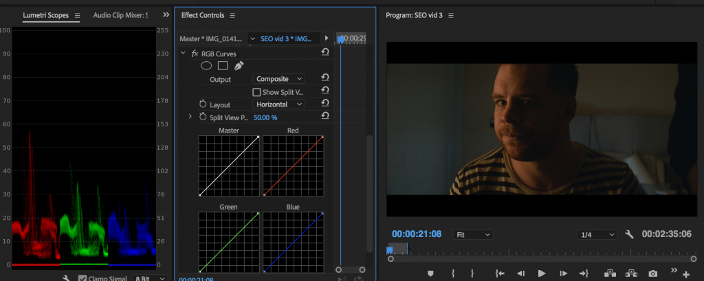
The white line is exposure only.
Let’s start there.
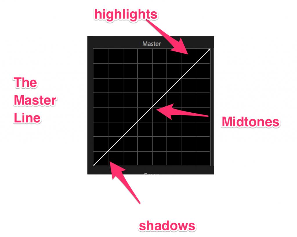
This “Master Line” controls the Red, Green, and Blue line all at once. We’ll make adjustments to those specific lines a bit later in looking at how to color grade.
The top part of the line is the highlights in the image, the middle part is the midtones, and the lowest part is the shadows of your image. Think of it as a spectrum from dark to light.
Now what happens when you start to adjust the line?
If we lower the highlight dot (the top dot), and raise the shadow dot (the bottom). This is what we get:
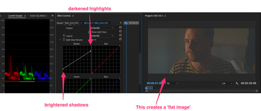
Now the line is starting to make sense a bit. Some small rules here.
1.) Don’t create too many dots.
You can add dots to this line to adjust, but try and keep it under 5. Anything above that is overkill.
2.) Keep the line smooth
You can bend the line, adjust highlights or midtones, but do everything you can to make it a smooth adjustment.
Here are some curve adjustments that show smooth adjustments.
S-Curve: Note how the line makes a faint ’s’
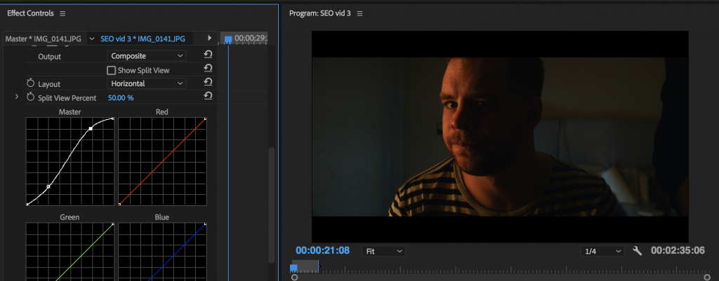
This added contrast to the image. It brightens the highlights and darkens the shadows. (Please note, this isn’t supposed to look good – I’m just showing you how these curves work!)
Here’s another slight adjustment (me eyeballing a less ‘contrasty’ image):
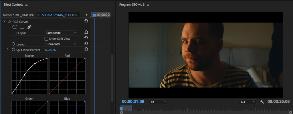
I brightened the shadows a bit, but still wanted a little bit of contrast in there.
Now that you have a basic understanding of the master line and how to color grade with it, let’s take a look at the Red, Green, Blue lines.
This is what most people get tripped up on.
Now, these lines are a tad different. The red line controls all the reds in the image. The green line controls all the greens, and I bet you can guess what the blue line does.
So you should know what happens when you ‘raise’ the red line.
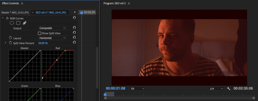
It adds red to everything. As you can see I raised the highlights, shadows, and midtones. More red for everyone!
Ok, now let’s take a look at what happens when we remove red? The absence of red is?
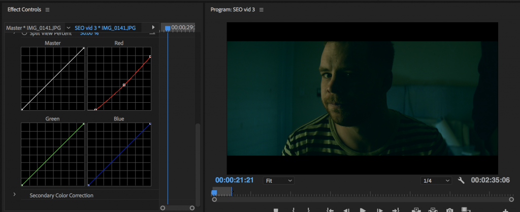
Whoa. We get this cool ‘cyan’ teal color. That looks extremely cinematic. A lot of films use ‘teal’ in the shadows because it compliments skin (this image actually shows that’s true).
Now take a look at this image to see what happens when you move the line up or move the line down!
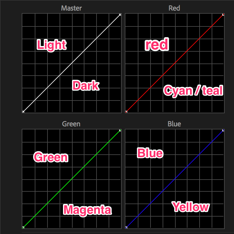
Any easy way to remember how to color grade using curves:
RGB – CMY
Red Green Blue – Cyan Magenta Yellow
Now you might be thinking, “when would I ever use this?”
These lines are insanely powerful if you are subtle with them.
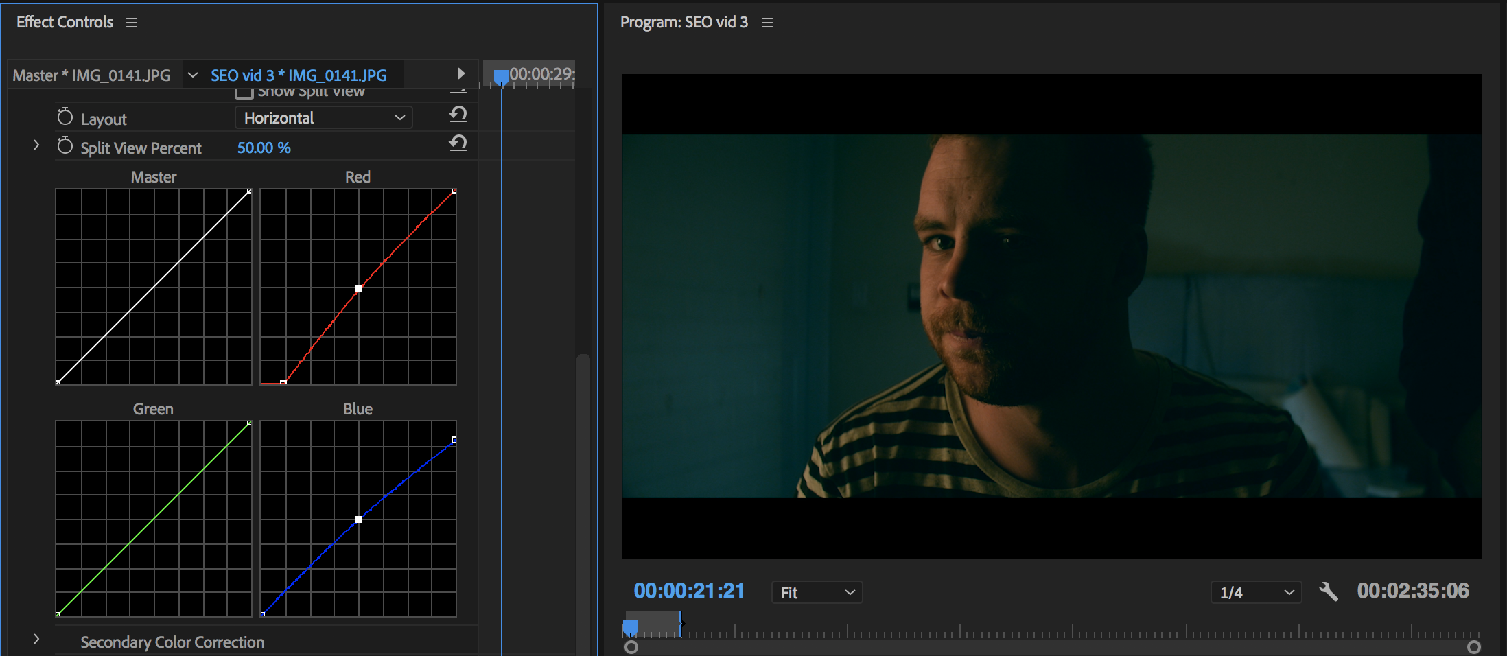
For example. Let’s say you want to get that traditional Hollywood ‘teal in the shadows, yellow in the highlights look.’
Boom, we know exactly how to do that!
Remember, be even more subtle than what I’m doing (I’m pushing it to show you clearly) – a little goes a long way!

Ok, let’s take a look how I achieved the ‘Hollywood look.’ I took out red in the shadows (gives you cyan) and I took out blue in the highlights (gives you yellow).
That’s one small example for you to use curves. Here’s another more vintage look (purple / red shadows).
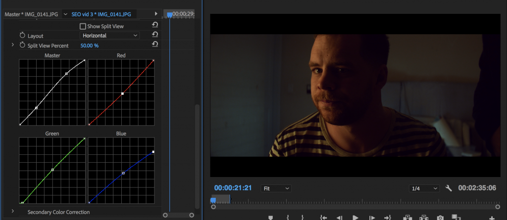
I removed green in the shadows (added magenta) and I removed blue in the highlights (added yellow). The midtones still seemed a little too ‘red’ – so I just pulled out the red in the midtones a bit!
Now it’s your turn to give it a shot. The next project you color grade – pull out the curves and start to mess around. See what kind of looks you can make.

Leave a Reply